Screening felt overwhelming
Evaluating applicants was a high-stakes task without a clear process to lean on, making the experience stressful and time-consuming.
Smart Screening was designed to help landlords move through tenant screening without feeling overwhelmed and compare applicants without losing the context they needed to make a decision.
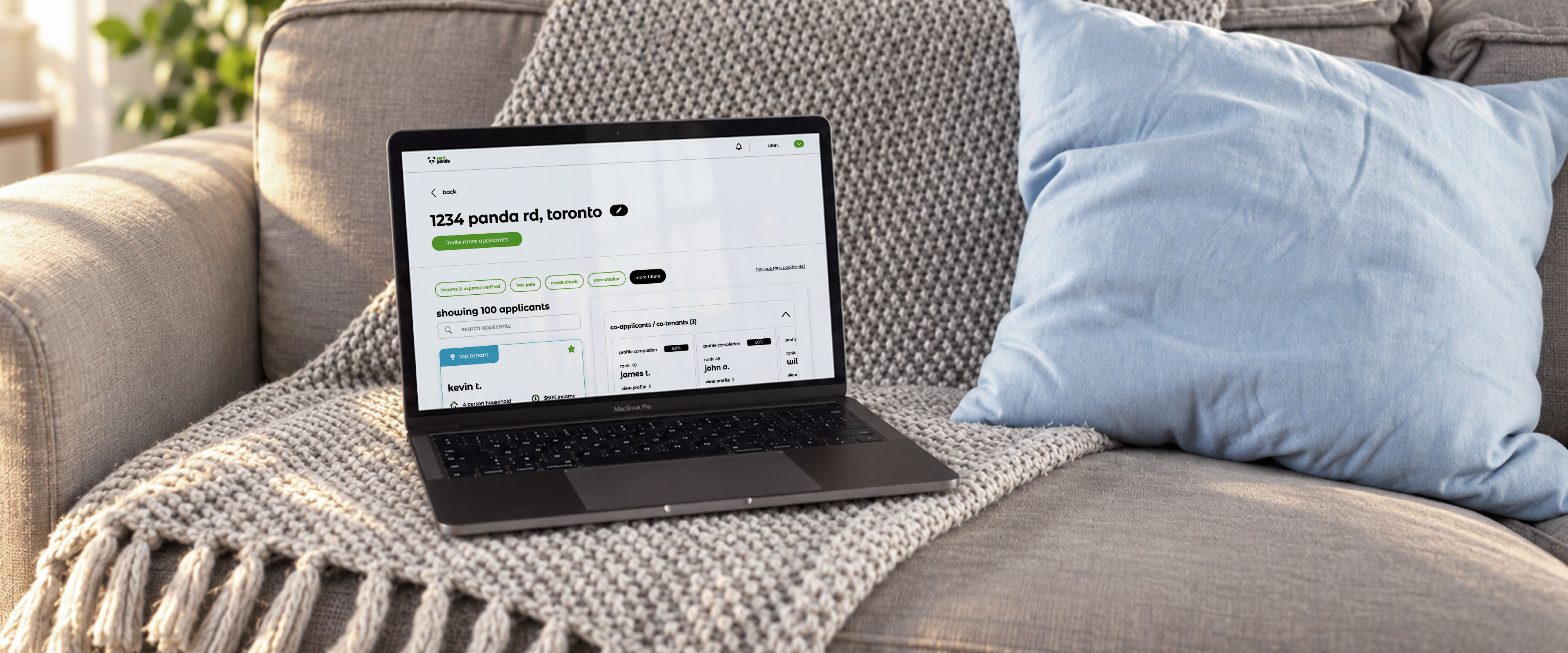
Landlords were collecting applicant information across fragmented platforms, conversations and manual screening steps. The information existed, but comparing it clearly was difficult.
The product needed to bring that process into one guided experience without making the final decision for the landlord.
As the sole UX/UI designer on the project, I translated landlord research debriefs and testing feedback shared by the CMO and CEO into the user flow, wireframes, interface directions and final interaction decisions.
By March 2023, Smart Screening was averaging 87 weekly active users with an average time on platform of 6:17. Those numbers were an early usage signal rather than long-term retention or conversion data.
The research debriefs pointed to the same underlying problem from several directions. Landlords had plenty of information, but very little structure for turning that information into a confident decision.
Evaluating applicants was a high-stakes task without a clear process to lean on, making the experience stressful and time-consuming.
Applicant details were spread across messages, listing platforms and separate screening steps, making comparison difficult.
The real problem was not generating more candidates. It was helping landlords understand which applicants were worth examining more closely.
Once the main friction points were clear, I used two questions to guide the hierarchy, flow and interaction decisions that followed.
The flow needed to keep landlords aware of where they were and what came next, while still allowing deeper screening when it became relevant.
Landlords needed to move between candidates quickly while keeping enough information visible to understand the differences between them.
Before moving into detailed interface design, I mapped the user flow to understand how landlords would move through the screening process. The flow helped identify where guidance was needed and where more advanced screening options could appear without interrupting the main path.
The beginning of the process was a natural moment to introduce screening options because the landlord was already making a setup decision.
Additional checks could appear again when a landlord moved from browsing candidates into evaluating one person more closely.
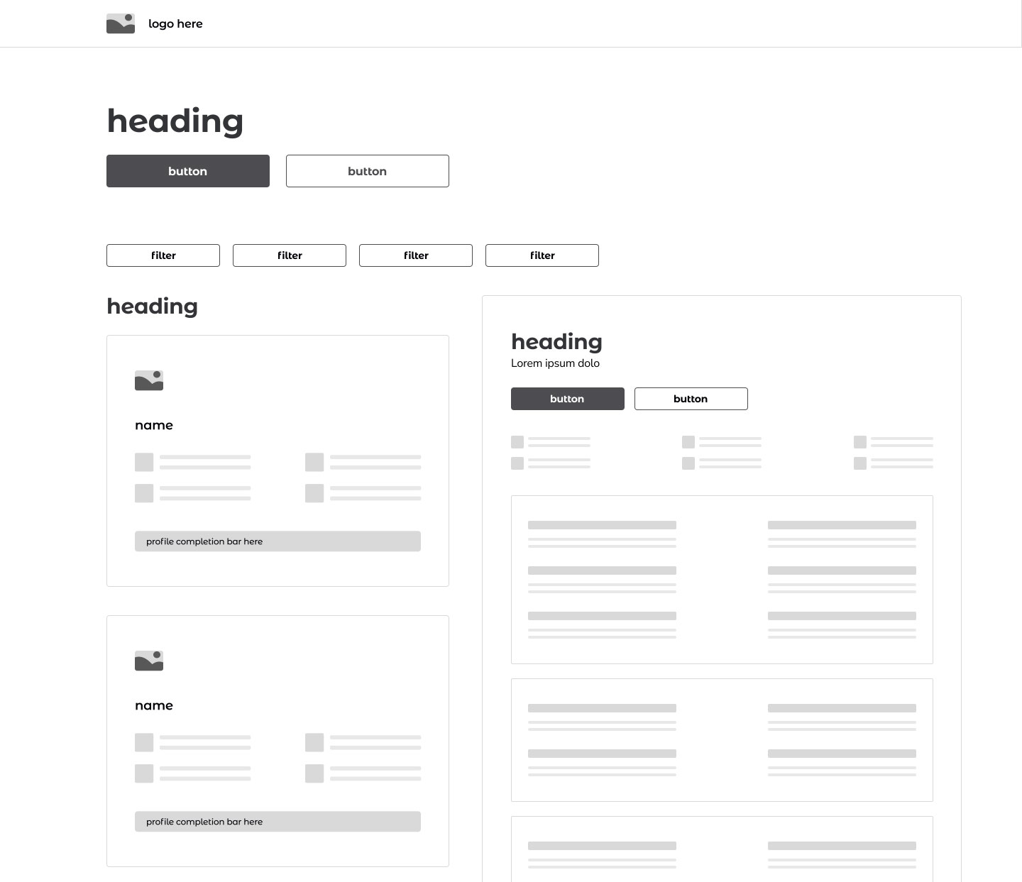
I explored two ways of presenting applicant information. The difference was not primarily visual. Each layout changed how much context a landlord could keep while moving from one candidate to another.
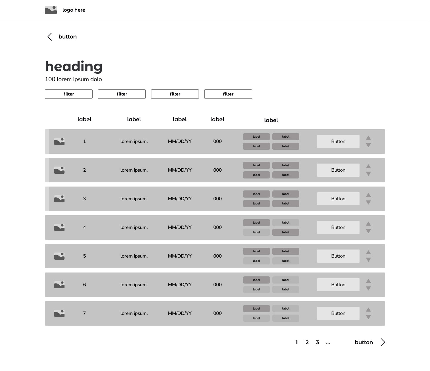
The table created an efficient overview, but landlords still needed to open applicants separately to see the detail behind each row. Moving between candidates meant repeatedly leaving the broader comparison context.
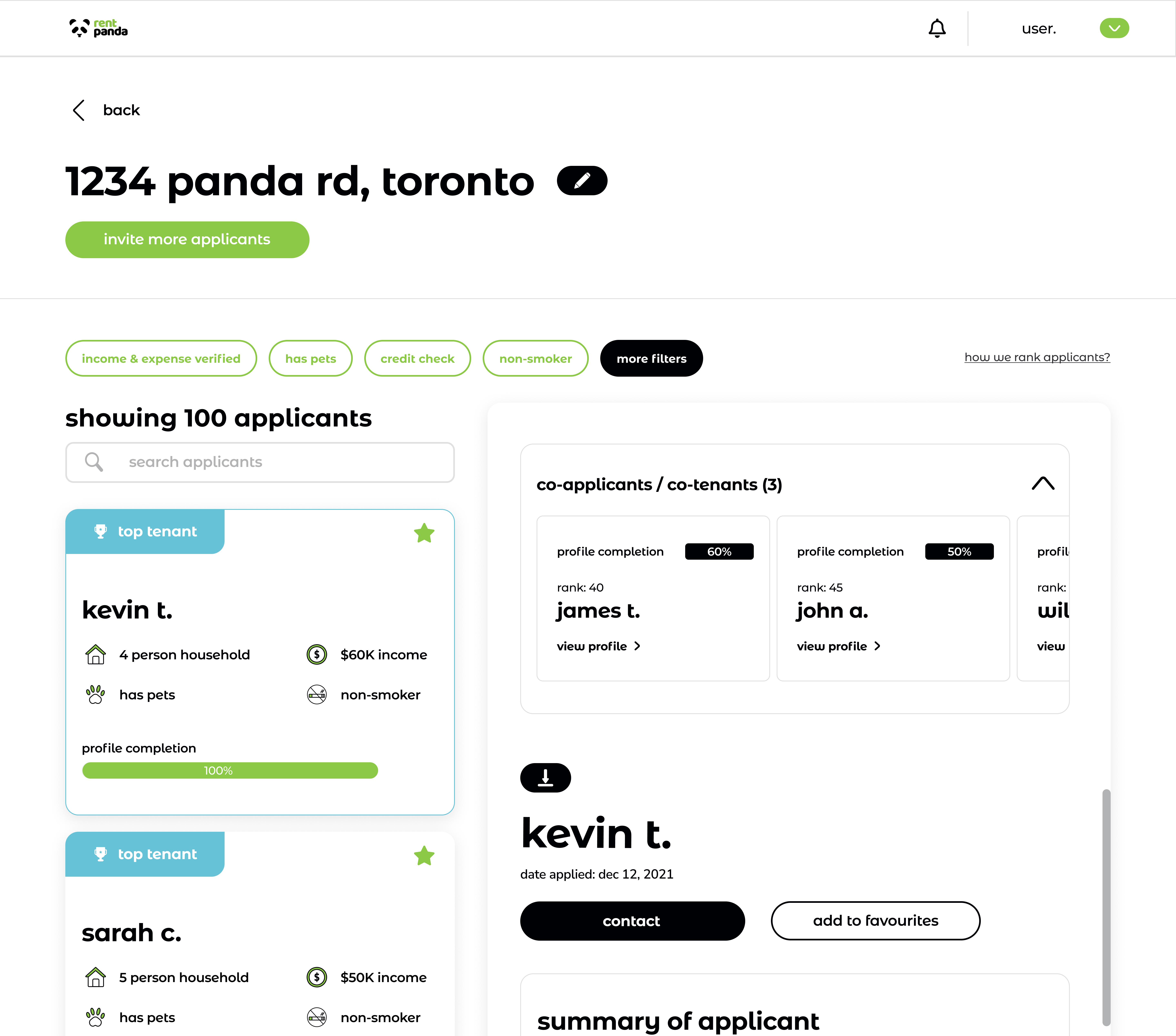
Keeping the applicant list visible while details changed beside it allowed landlords to move between candidates without losing their place or the broader comparison context.
I presented both directions to the CMO and CEO, who reviewed them with the leasing team and landlords and brought the feedback back into the design process.
The preference for seeing the applicant list and full details at the same time made the split view the stronger direction. It matched how landlords wanted to compare people: move between candidates without repeatedly losing context.
I designed the interaction around pacing complexity rather than showing every choice at once. The goal was to keep landlords oriented through the screening process while making additional options available when they became useful.
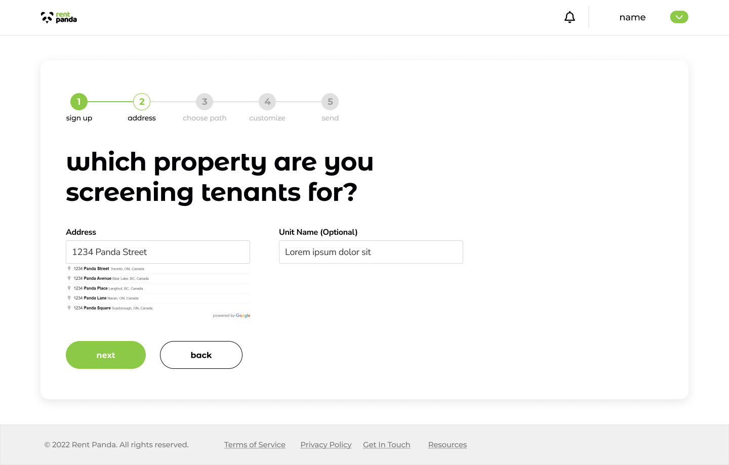
Instead of one long form, onboarding was divided into focused screens with a visible progress indicator so landlords always knew where they were in the process.
Advanced screening options appeared when landlords were already making a related choice, keeping the main flow simpler without removing access to deeper evaluation.
The final experience kept the main path understandable while giving landlords enough depth to evaluate candidates more closely when needed. The interface was organized around reducing uncertainty rather than simply displaying more data.
Focused steps and visible progress helped make the setup process easier to follow without presenting everything at once.
Ranking and screening signals helped landlords identify applicants worth examining more closely without replacing their final judgment.
The split layout kept the applicant list available while full details changed alongside it, making movement between candidates more fluid.
By March 2023, Smart Screening was averaging 87 weekly active users. Average time on platform was 6:17 across an experience centered on reviewing and comparing applicants.
These figures were early usage signals rather than evidence of long-term retention or conversion, but they showed that landlords were actively spending time with the screening experience after launch.
This project reinforced how important it is to map the decision process before polishing the interface. The strongest interaction decisions came from understanding where landlords needed guidance, where they needed more information and where the interface needed to stay out of the way.
It also showed me the limitation of working from research debriefs rather than direct observation. The feedback loop materially changed the product, particularly the move toward the split view, but in future product work I would want to be closer to the interviews and usability testing whenever possible.