Structure
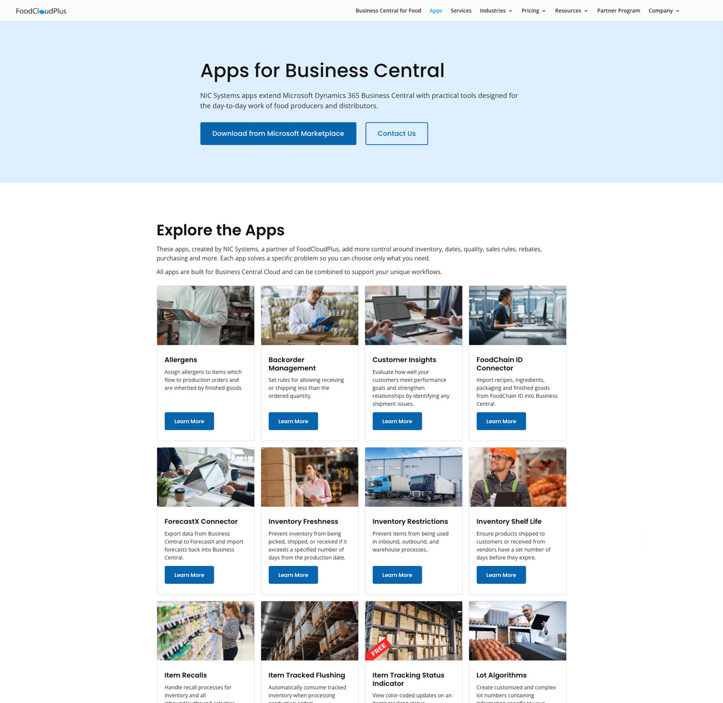
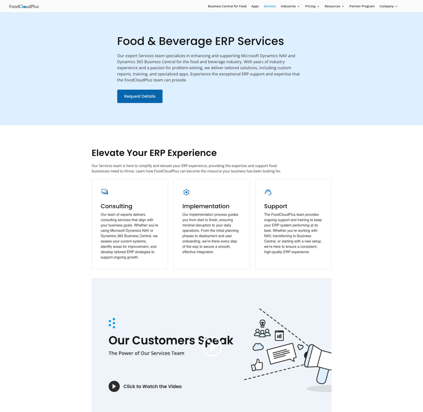
Duplicate CTAs, overlapping navigation paths and unclear page names made some destinations harder to predict.
FoodCloudPlus had evolved over time, but inconsistent visual treatments and unclear navigation meant the website no longer felt like one connected system. Over seven weeks, I stepped back to understand how those inconsistencies had developed, clarified the structure and visual language, and created reusable patterns that made the site easier to understand and maintain as it continued to grow.
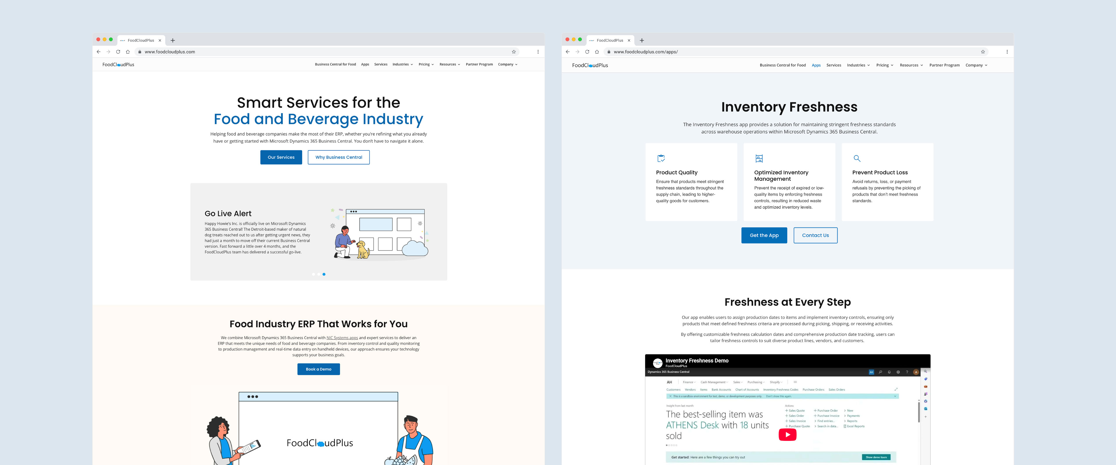
FoodCloudPlus had not seen a meaningful website update in years. The pages followed a broadly similar layout, but the visual language around them had become inconsistent. Colours and CTA treatments varied from page to page, similar actions appeared repeatedly, and page names and labels did not always describe destinations consistently.
Large image-heavy hero sections also made readability harder to control and added unnecessary page weight. The redesign needed to bring the site back into one clearer system without simply replacing the existing website with a new look.
I led the redesign from internal stakeholder research and a page-element audit through visual exploration, interface design and launch. I reviewed recurring sections, navigation paths and calls to action, defined the principles for the redesign, created reusable interface patterns and worked with the content team on clearer labels and page structure.
The project was scoped and delivered in approximately seven weeks.
The redesign brought FoodCloudPlus back into a more consistent visual and structural system, with clearer navigation, more intentional calls to action and reusable patterns for future pages.
After launch, page-load time moved from 1.7 seconds to 0.9 seconds, while GA4 average engagement time increased from 47 seconds to 54 seconds in the initial two-week comparison.
Rather than start by deciding what the new website should look like, I wanted to understand why it no longer felt like one connected system.
I created a structured questionnaire and shared it with team members across sales, marketing and development. I chose people from different roles because they worked closely with clients and interacted with the website in different ways.
Eight responded, pointing to recurring concerns around finding information, inconsistent visual treatments and pages that felt slow or heavy. I treated those responses as signals for where to look more closely rather than answers to what the redesign should become.
Duplicate CTAs, overlapping navigation paths and unclear page names made some destinations harder to predict.
Colours and CTA treatments varied from page to page, weakening the sense of one coordinated visual system.
Some pages felt slow to load, while image-heavy hero sections made text contrast difficult to control consistently.
I mapped recurring sections, CTA labels and destinations across the website. Looking at pages side by side made patterns easier to see than moving through the site one page at a time.
The issue was not one broken page. Similar destinations were described with different labels, generic CTAs were reused across different contexts, and related content had gradually stopped following the same structure.
Microsoft AppSource could be reached through different CTA labels on the same page. One label did not clearly suggest that the visitor would leave FoodCloudPlus for an external destination.
The destination was the same, but the language changed. The first label sounded more like an internal information page than a link to Microsoft AppSource.
The homepage described the offering as Services, the destination page was called Solutions, and the same content sat under Software in the navigation. None of those terms was necessarily wrong on its own, but together they made the structure harder to follow.
Visitors could encounter Services, Solutions and Software around the same content area without a clear explanation of how those terms related to one another.
Three different apps were introduced in separate sections, but each section repeated the same call to action and sent visitors back to the general Apps page.
The content had already become specific to individual apps, but the next step became generic again.
The audit showed that navigation, labels and calls to action had gradually stopped following the same logic. That shifted the task from fixing isolated pages to rebuilding a clearer shared system.
Across the site, similar destinations were described in different ways, while repeated calls to action made it harder to tell which action mattered most.
I reduced duplicate paths, made page names and CTA labels more consistent, and placed key actions where visitors had enough context to decide what to do next.
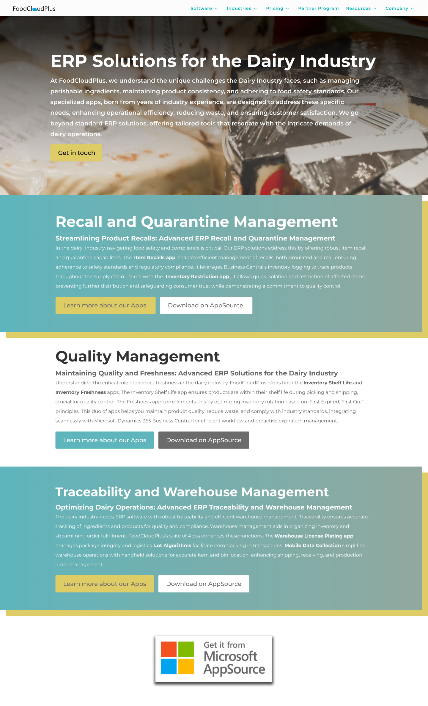
The original page presented several actions at once. “Learn More About Apps” and “Download on AppSource” could lead visitors toward the same external destination, while additional text links introduced another route to the Apps page. CTA colours and treatments also changed within the page, making the hierarchy of those actions less predictable.
In the redesign, I reduced the number of competing paths and gave the hero one clear primary action. Supporting links were then used more intentionally, including a text link to the specific app page rather than sending visitors back to Microsoft AppSource. I also made those text links more recognizable through consistent bold and underlined styling.
Once the page organization was clearer, I focused on the visual elements that repeated across the website.
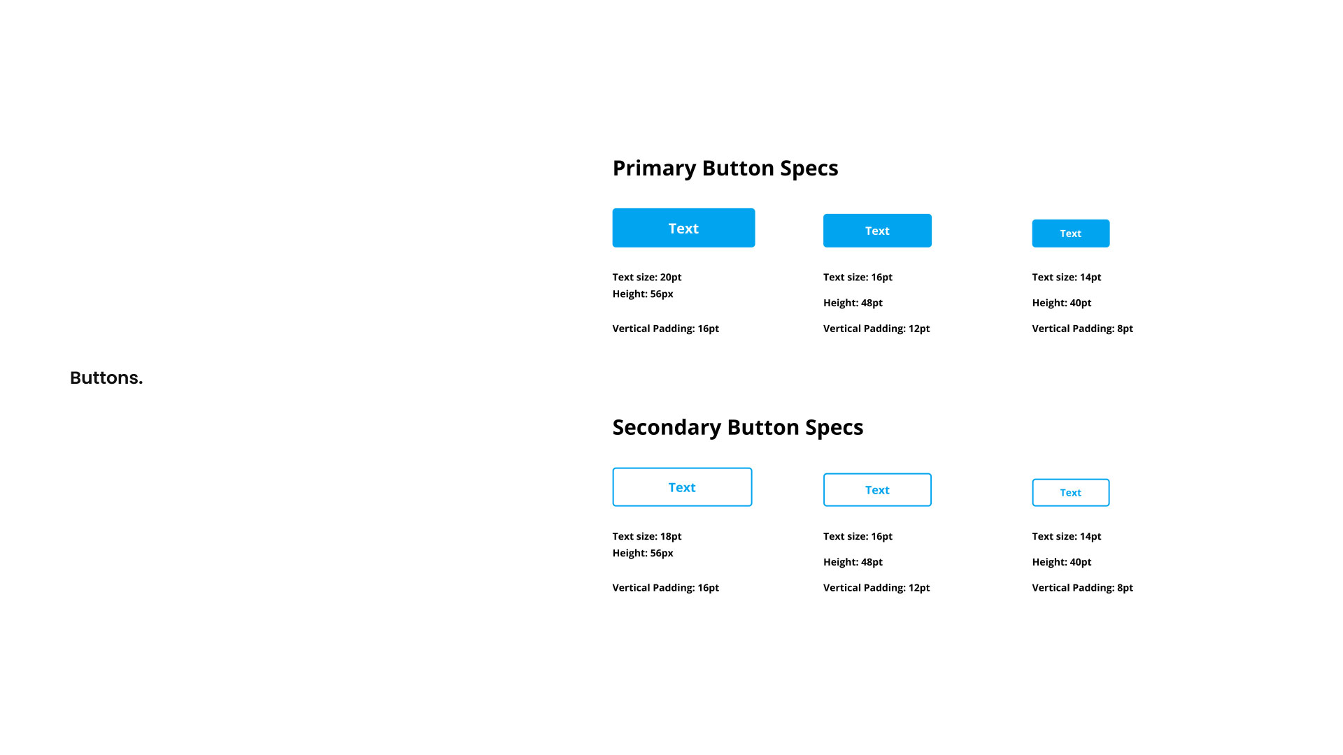
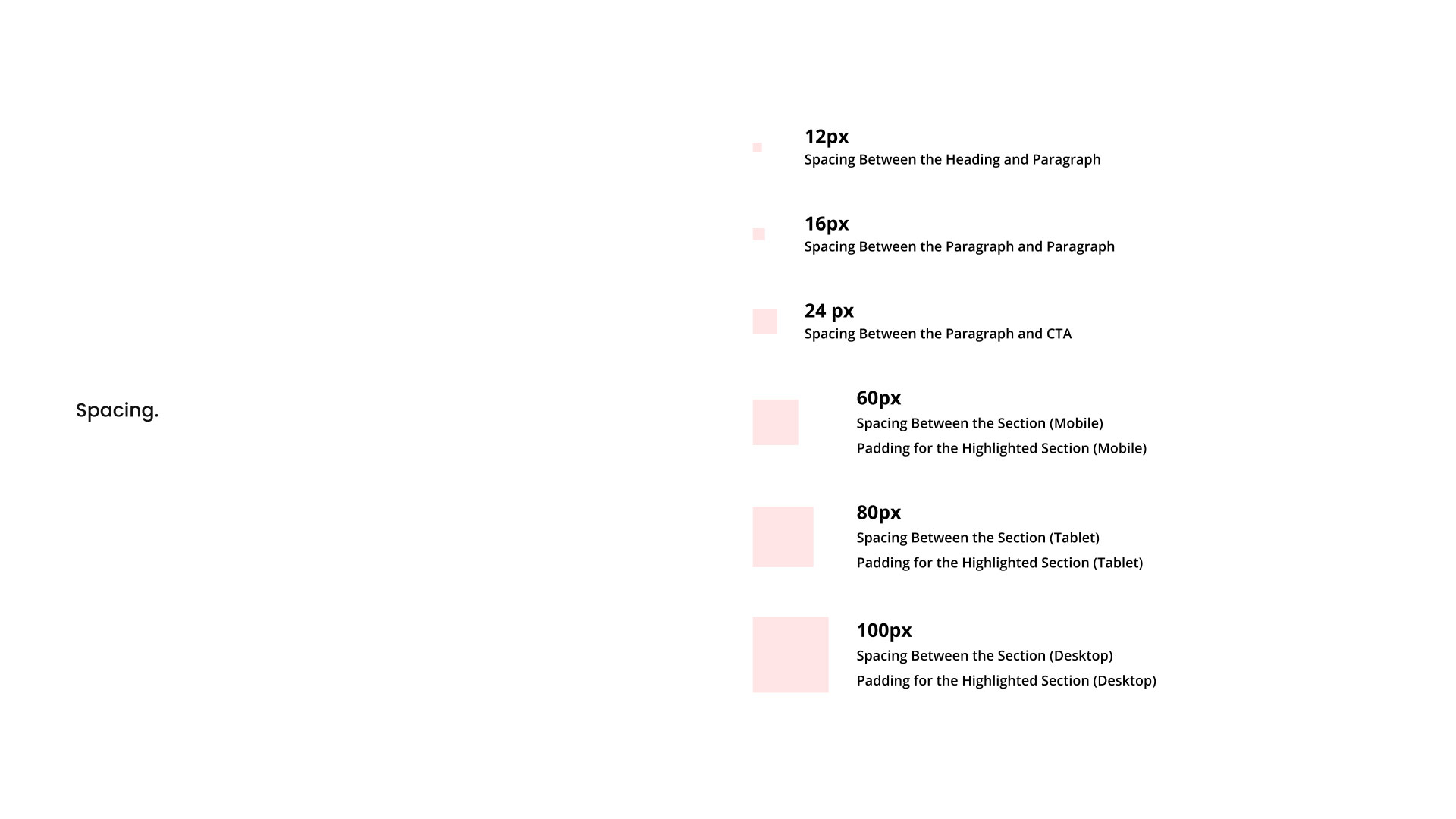
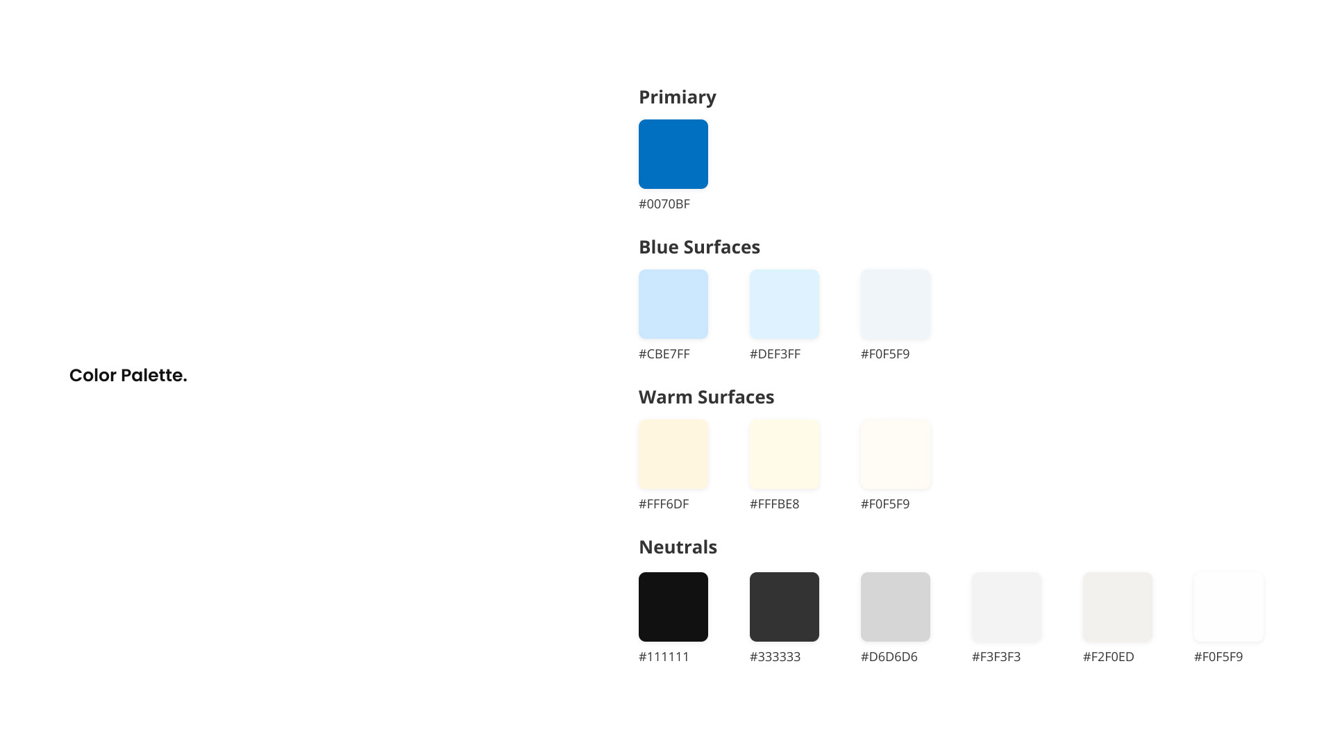
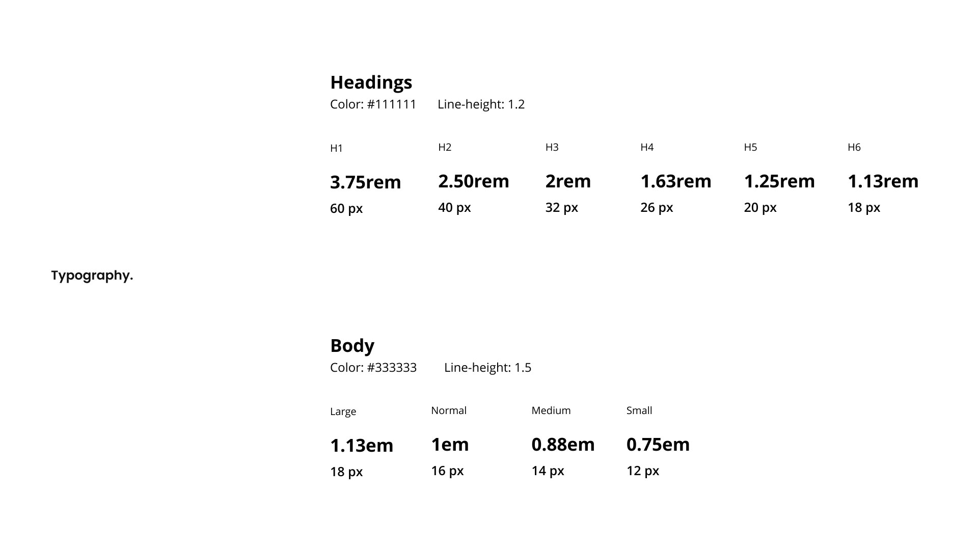
I standardized typography, button treatments, spacing, padding and colour usage so the same elements followed the same rules from page to page.
Repeated type scales made page structure easier to scan.
Primary and secondary CTA treatments followed shared rules.
Padding and section spacing became repeatable rather than page-specific.
Colour combinations were checked against WCAG contrast requirements.
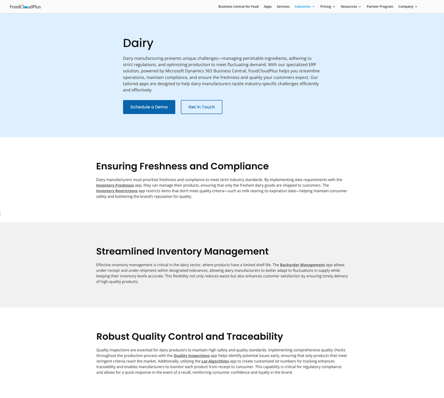
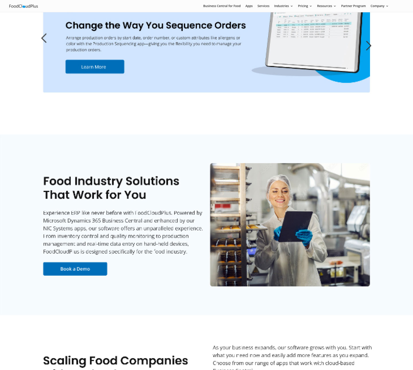
The hero sections were one area I wanted to look at more closely. On some pages, the text appeared before the background image had fully loaded, while the image-based layout also made text contrast difficult to control consistently.
Each image had different brightness, composition and exposure, so the same overlay treatment did not always produce the same level of readability. I wanted to see whether a simpler hero treatment could give me more control over both the message and the loading experience.

A tighter image-led approach with stronger contrast and optimized assets.

A simpler direction that relied more heavily on FoodCloudPlus's brand colours and removed the large hero image altogether.
“It feels too blue.”
After applying the colour-led direction across the homepage, I received feedback from the team that the page felt too blue. Stepping back, I realized the direction itself was not the problem. I had relied too heavily on the primary brand colour, making several sections feel visually similar.
Primary blue carried through too many sections, reducing separation across the page.
Existing accent colours created clearer section separation while keeping the colour-led direction intact.
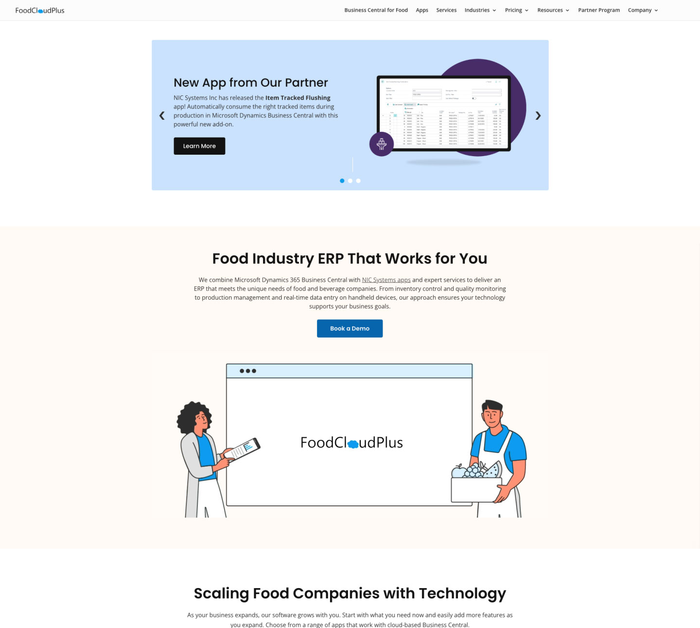
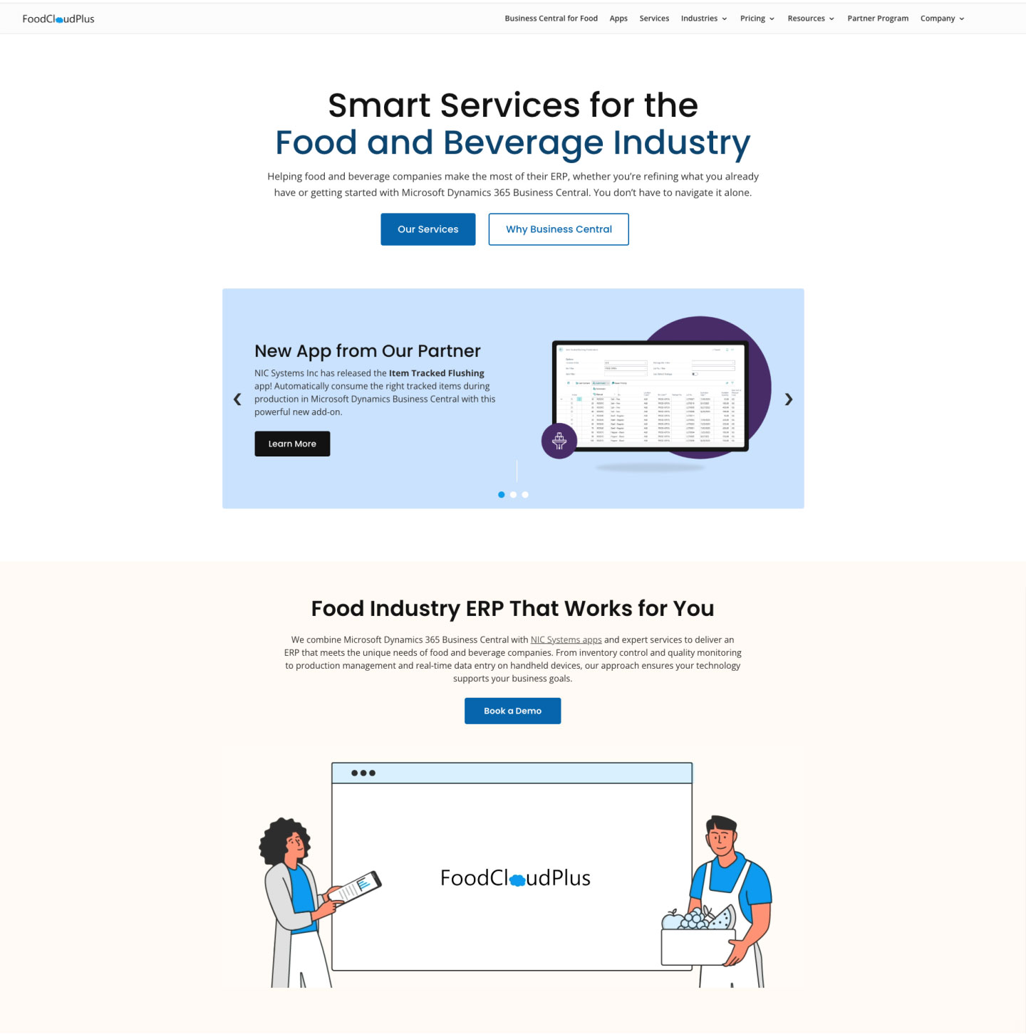
Rather than abandon the direction, I brought more of the existing accent palette into selected sections, creating clearer separation and a better visual rhythm across the homepage.
With the navigation, visual rules and hero direction established, I applied them across the homepage and interior pages.
Dense service content was reorganized into more scannable layouts, CTA treatments and labels followed the same rules, and common sections had reusable patterns to build from.
The engagement comparison covered the two weeks after launch against the two weeks before. Conversion tracking was not in place, so I treat the increase as an early signal rather than evidence of a long-term behavioural or business outcome.
Several parts of the website changed at the same time, so I would not attribute the page-load improvement to the hero treatment alone.
What stayed with me most from this project was how easily a website can lose its consistency one small decision at a time. No single page had caused the problem. Colours, labels, calls to action and other decisions had gradually stopped following the same logic.
The project also reinforced the importance of understanding what feedback is actually pointing to. When the homepage felt too blue, the answer was not to abandon the colour-led direction. It was to understand why the page lacked visual separation and adjust the execution without losing what was already working.