100% left
Rent Panda's landlord-facing marketing moved across social, educational content, print, events and property video. As Lead Designer, I adapted the visual execution to what each environment needed while keeping the brand recognizable across them.
Rent Panda used social media to promote its services, events and educational content across Facebook, Instagram and LinkedIn. I created a range of static and animated graphics that carried a consistent Rent Panda look across these different kinds of communication.
For selected posts, I also created simple animated graphics rather than relying only on static assets. Motion gave me another way to bring key messages to life and add variety to the brand's social presence while staying within the same visual language.
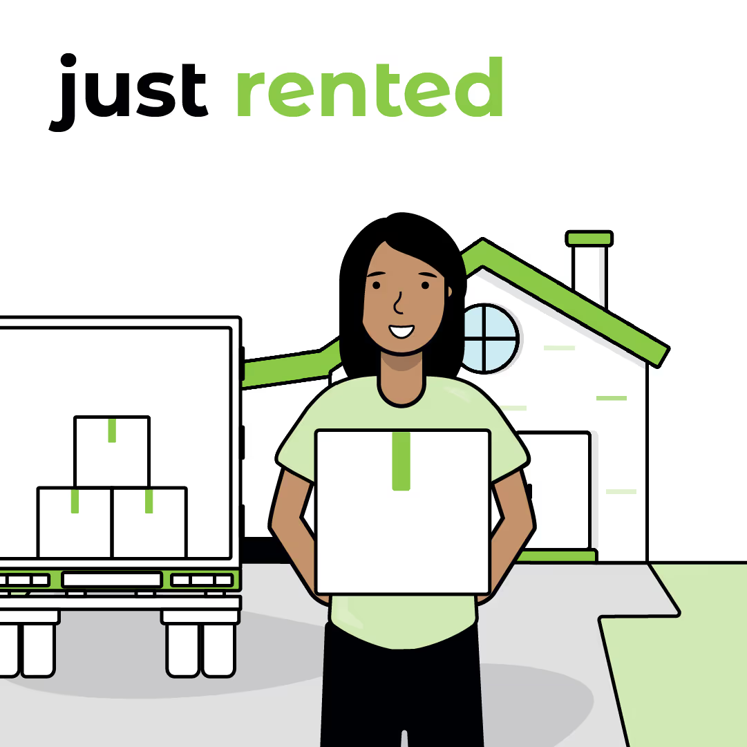
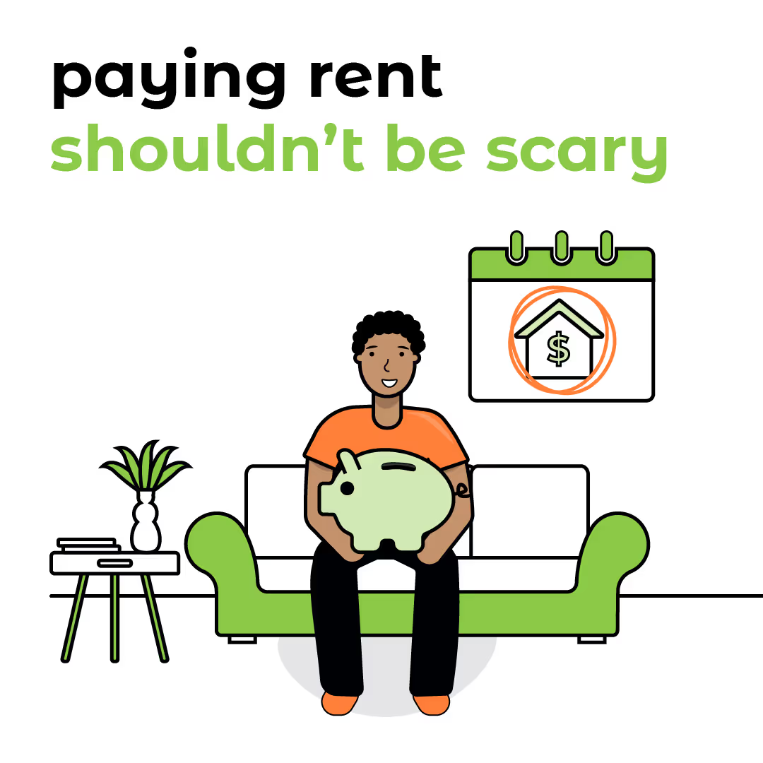
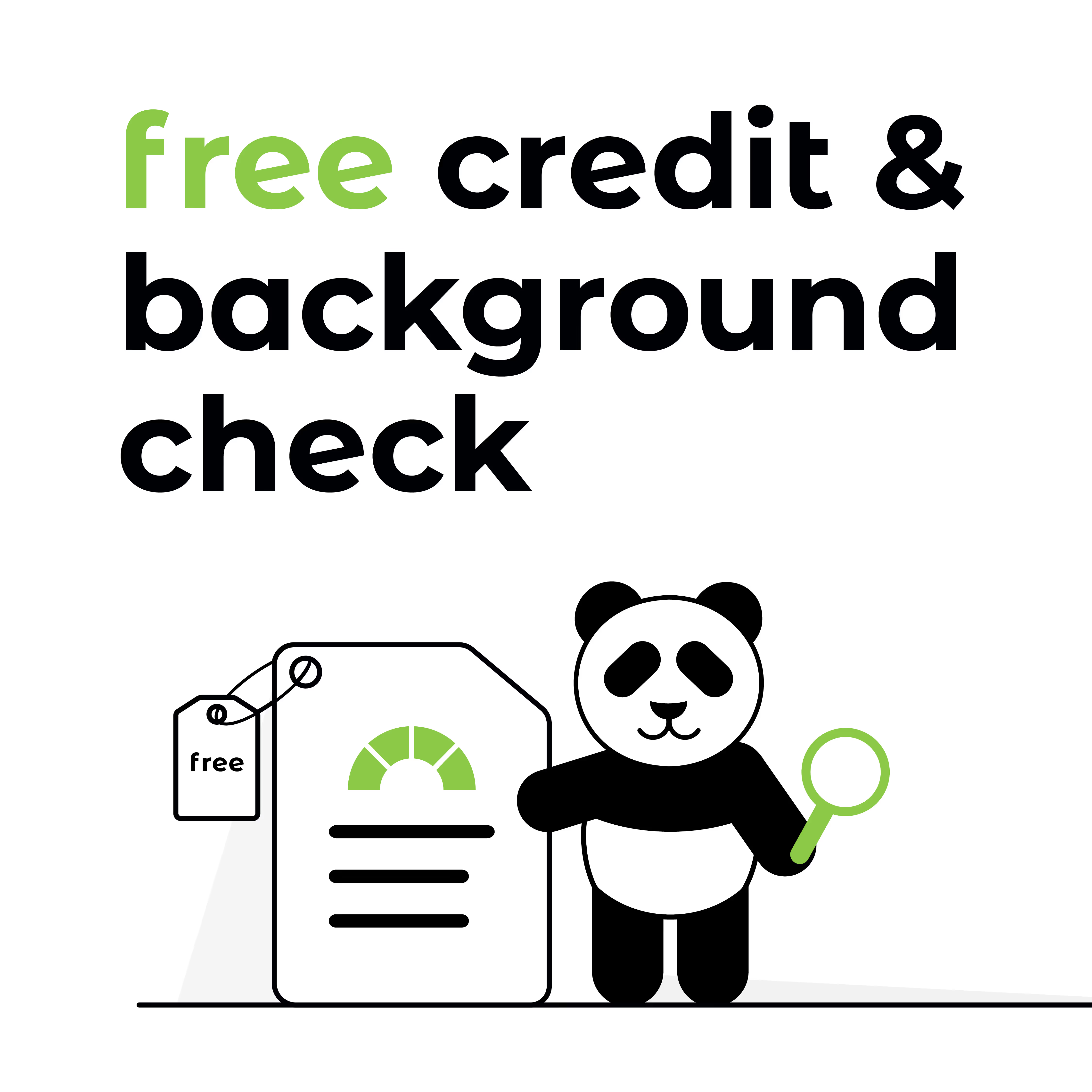
For paid campaigns, the message needed to be clear at a glance. It still needed to feel like Rent Panda, but the main point had to come through quickly as someone moved through the feed.
For two Facebook campaigns, I received finalized copy and translated the messaging into branded visual assets. Depending on the message, some executions stayed close to Rent Panda’s organic social language, while others used simpler layouts and stronger typographic hierarchy to make the key point easier to understand at a glance.

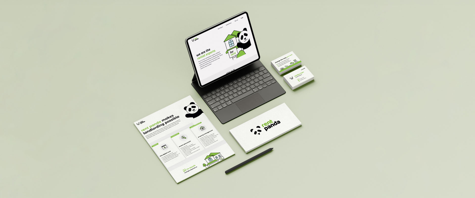
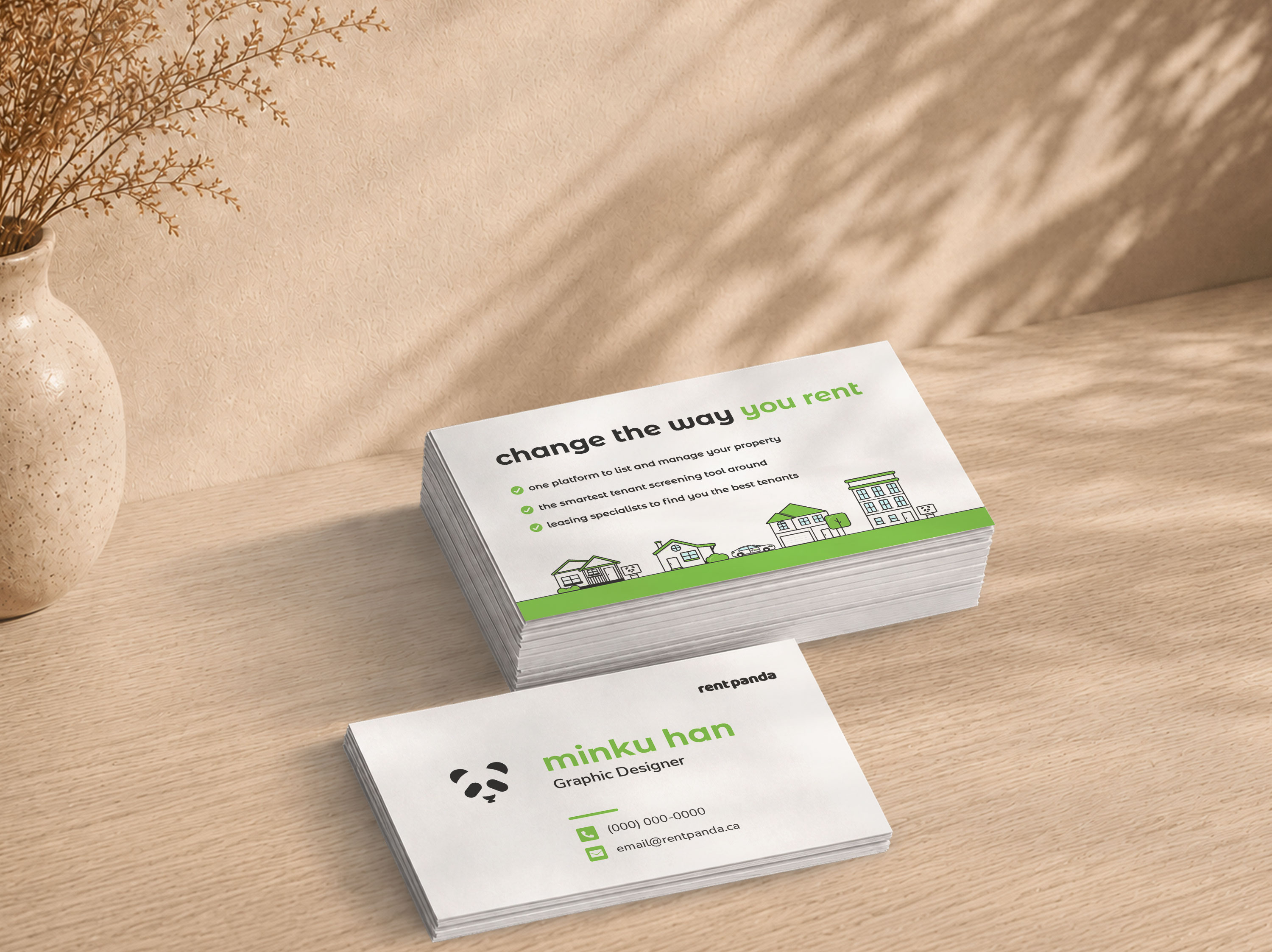
Rent Panda also needed printed materials that could support landlord outreach beyond the screen. I designed print touchpoints including one-pagers and business cards, using familiar brand elements while adapting each piece to the amount of information it needed to communicate and how it would be used.
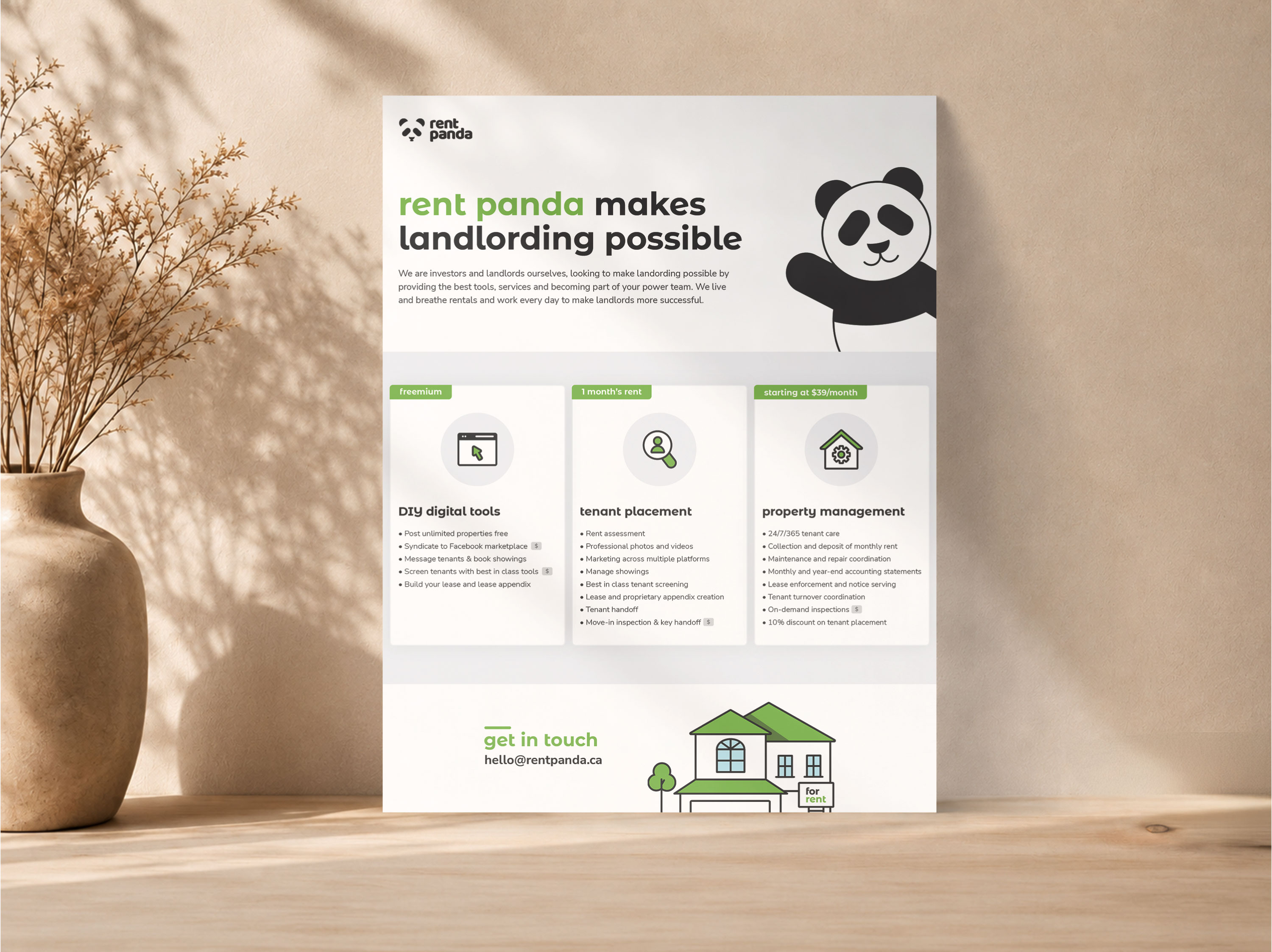
For information-heavy one-pagers, the priority was scanability. I grouped related information into repeated sections, used spacing and hierarchy to separate services, and introduced simple icons where they could help readers distinguish features more quickly.
The business card needed much less information and allowed for a more personal expression of the brand, so I used custom illustration and familiar Rent Panda visual cues rather than treating it like a reduced version of the one-pager.
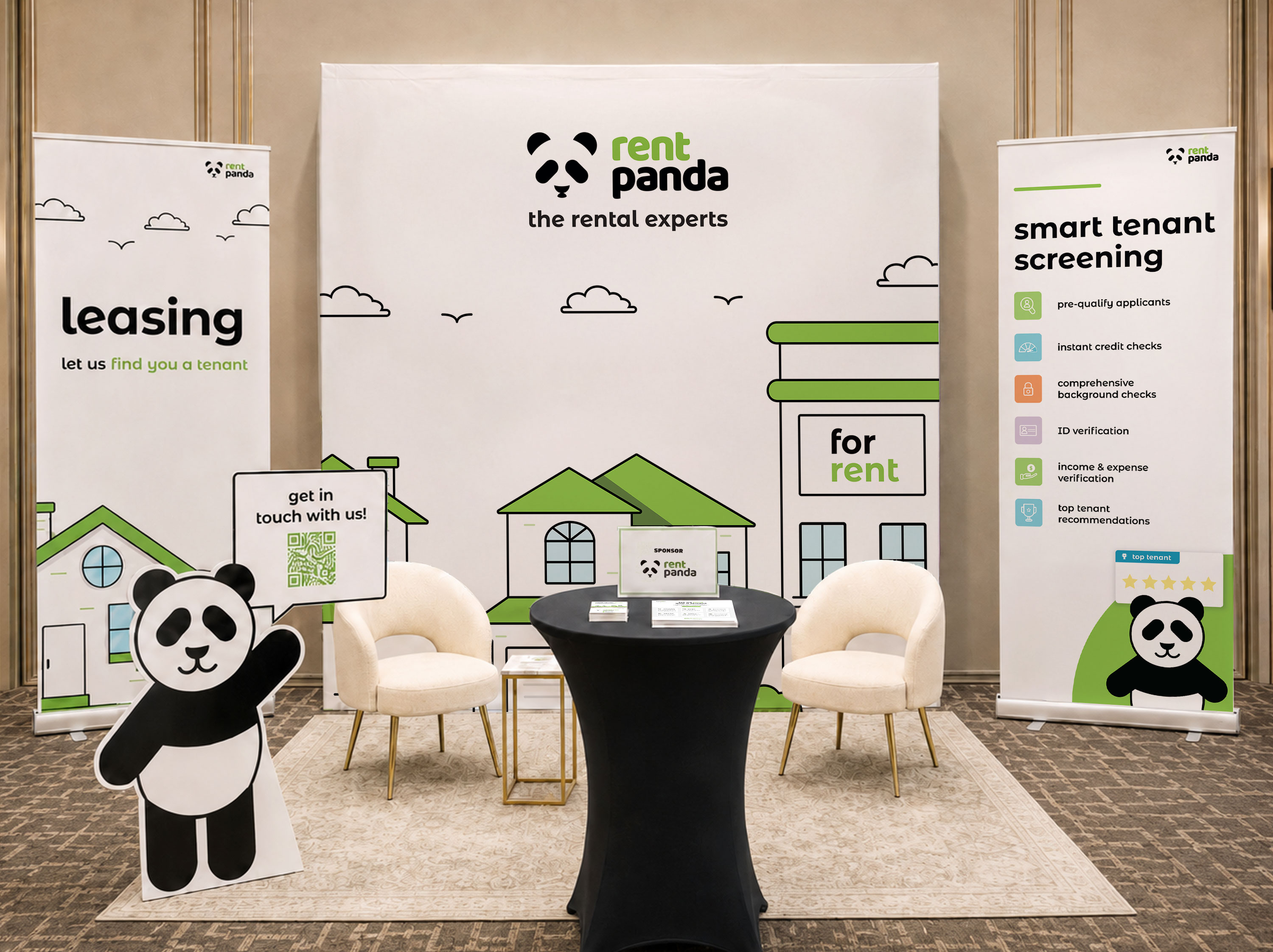
For Rent Panda’s conference presence, I led the creative direction and design across the banners and supporting event materials. Leadership identified the core pieces we needed, while I developed how they could work together visually and how Rent Panda should feel in the space.
I wanted the booth to feel warmer and more approachable within the open conference environment. Early in the process, I sketched how the stand banners could work together to create a more defined area around the booth rather than treating each one as an isolated display. That thinking shaped the visual direction and how the final pieces worked as a group.
Leadership also suggested giving visitors a way to engage with Rent Panda independently when the team was already speaking with someone. I translated that idea into a life-sized panda mascot cutout holding a QR code linked to the website, giving visitors a simple way to explore the brand on their own while bringing a familiar Rent Panda element into the physical space.
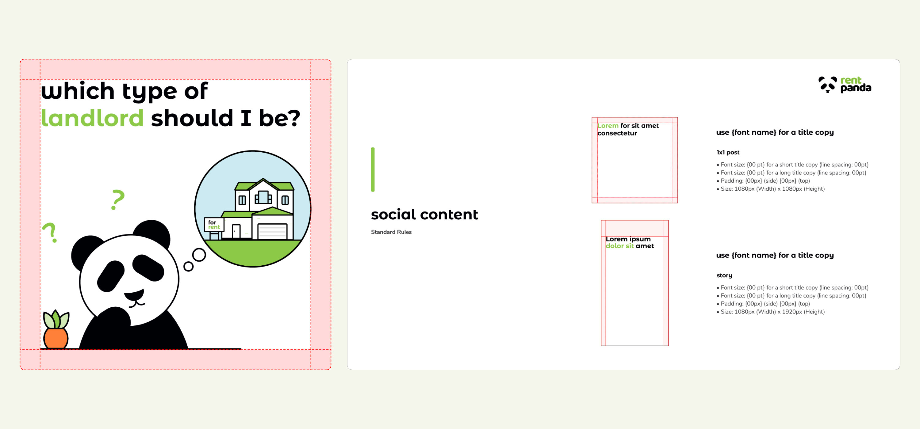
As the volume and variety of social content grew, I gathered input from the team on where clearer guidance would be useful, then documented practical layout rules for recurring social assets.
The guidelines covered title sizing for different text lengths, horizontal padding, line height and spacing. Rather than creating a rigid template for every post, the goal was to give other designers enough structure to keep the work recognizable while still allowing layouts to respond to different content.